GRAPHICS

Book Three

INEQUALITY AND DEMOCRACY

Inequality and Democracy introduces a unique dynamic model of the welfare of the society in Chapters 1 and 2.

The model includes many graphics, which are presented in high-resolution colors below, for those readers who preferred print copies that permit only grayscale and limit the size of any graph to one page.

Section 1.1 Graph [1.1.A] : Accumulated Wealth vs Growth Rates
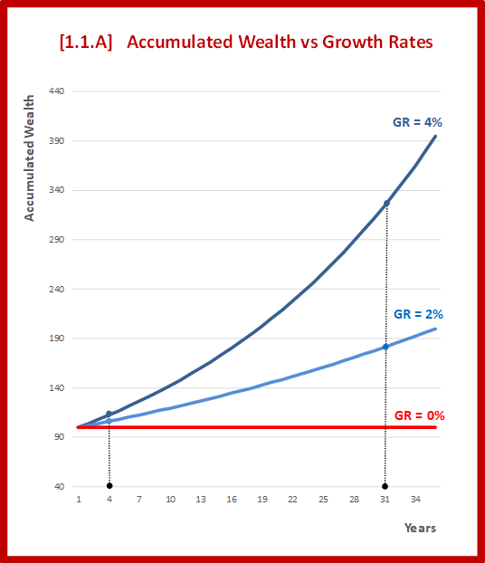
A line chart from the book "Inequality and Democracy" titled 'Accumulated Wealth vs Growth Rates', showing the differences in the accumulated Wealth of three societies with different growth rates in the long run.

Section 1.1 Graph [1.1.B] : Levels of Inequality
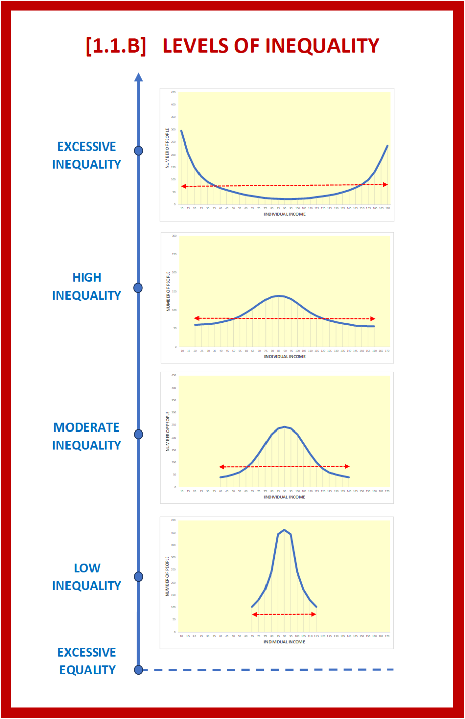
A line chart from the book "Inequality and Democracy" showing different levels of income inequality.

Section 1.2 Graph [1.2.A] : Growth Rate vs Inequality
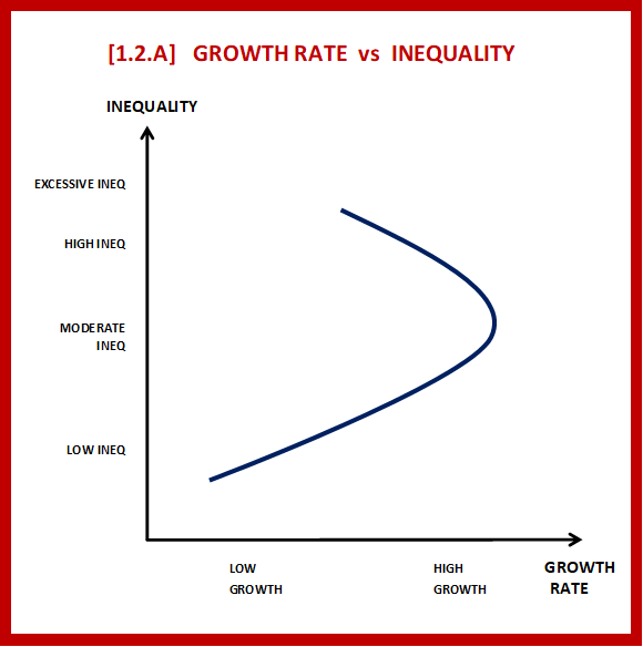
A line chart from the book "Inequality and Democracy" titled 'Growth Rate vs Inequality'.  Reveals how growth rate initially increases from low levels of inequality towards moderate levels, but then decreases as inequality rises to higher levels.

Section 1.3 Graph [1.3.A] : Welfare vs Inequality & Growth Rate
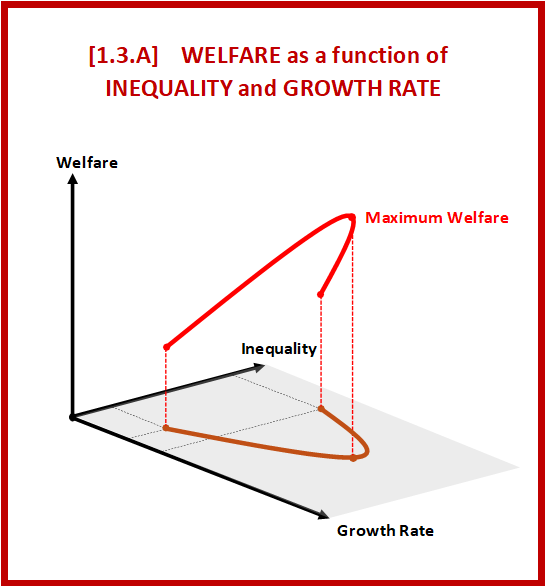
3D graph from the book "Inequality and Democracy"  illustrating Welfare as a non-linear function of Inequality and Growth Rate.

Section 2.1 Graph [2.1.B] : Dynamics of Policy Cycles
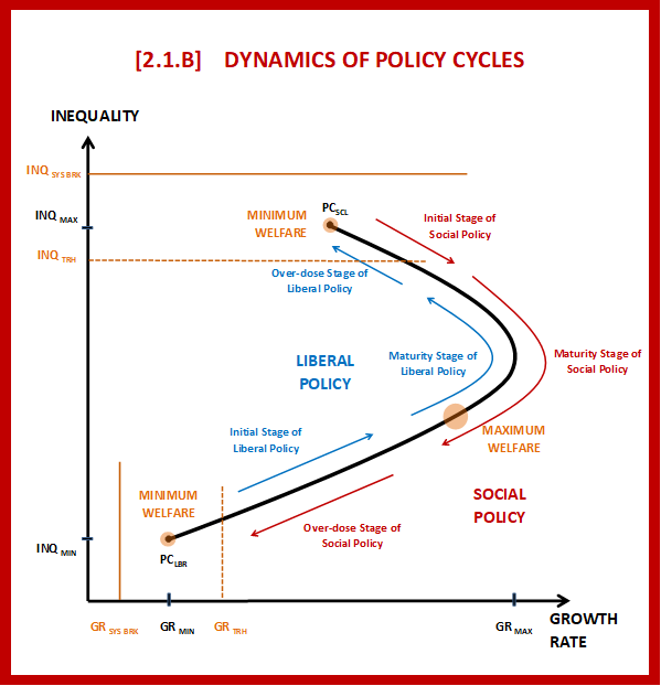
A graph from the book "Inequality and Democracy" titled 'Dynamics of Policy Cycles' illustrating the non-linear relationship of inequality and growth rate, depicting the changes in time through liberal and social policies.

Section 2.2 Graph [2.2.A] : Policy Cycles of Two Societies with Different Intellectual Levels
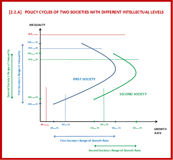
A graph from the book "Inequality and Democracy" illustrating the policy cycles of two societies with different intellectual levels, showing the corresponding ranges of growth and inequality for each society.

Section 2.2 Graph [2.2.B] : The Learning Curve
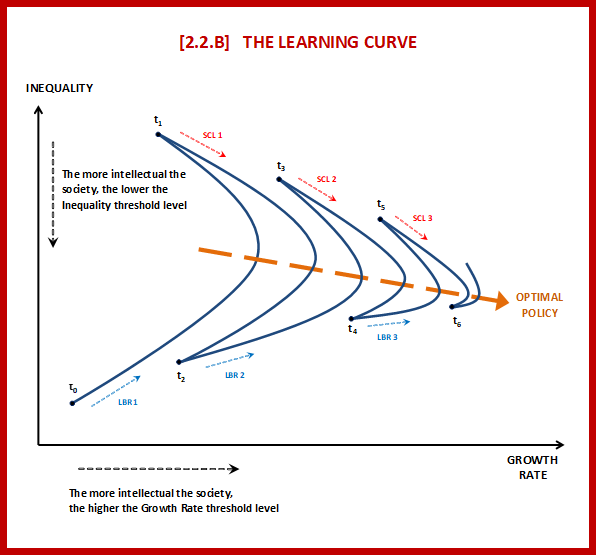
A diagram from the book "Inequality and Democracy" illustrating the consequent stages of policy cycles and the learning curve of the society.

Section 2.2 Graph [2.2.C] : Welfare vs Learning Curve
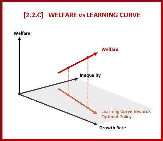
A 3D graph from the book "Inequality and Democracy" illustrating the relationship between welfare and the learning curve of the society, where the learning curve lies on a plane defined by growth rate and inequality.

Section 2.2 Graph [2.2.E] : Actual vs Acceptable Inequality
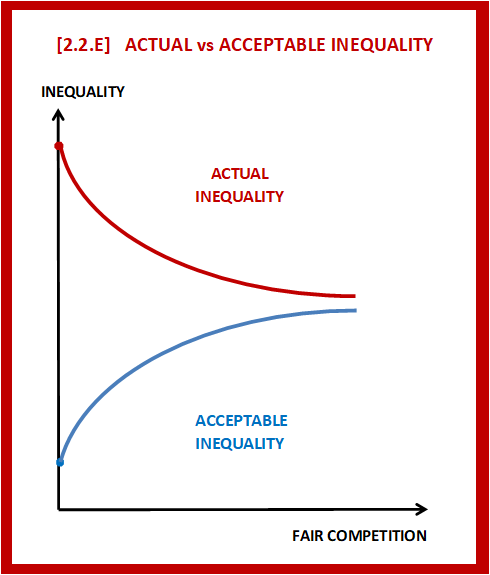
A graph from the book "Inequality and Democracy" comparing actual and acceptable inequality levels,  showing their relationship with fair competition.